The Importance of White Space in Graphic Design
In the world of graphic design, there is a common misconception that filling every inch of a layout with images, text, and various design elements is essential for creating effective designs. However, one of the most important and often overlooked aspects of design is white space. Also known as negative space, white space refers to the empty areas between and around elements in a design. It is not just “empty” space; instead, it serves as a vital tool for clarity, balance, and creating a visually appealing design. In this article, we will explore the importance of white space in graphic design and how it can enhance the effectiveness of your designs.
What is White Space in Graphic Design?
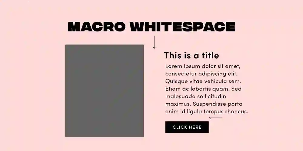
White space is the blank area between elements in a design that helps to organize content and improve the overall aesthetic. While many associate white space with simply being empty, it’s actually a powerful design element that can shape the viewer’s experience. White space can be used in various forms, such as:- Margins: The empty space surrounding the edges of a page or screen.
- Padding: The space between elements, such as text and images.
- Line spacing: The space between lines of text.
- Gaps: The space between paragraphs or other content.
Why White Space Matters in Graphic Design
White space is often an underrated element of design, but its role cannot be overstated. Here’s why it matters:1. Enhances Readability and Legibility
One of the key benefits of white space is that it enhances the readability of your design. When text is cramped or placed too close to other elements, it can make the content difficult to read and overwhelming to the viewer. White space allows the text to breathe and improves legibility by giving it room to stand out. Properly using white space between lines of text, between paragraphs, and around headings can dramatically improve how easy and enjoyable it is to read your design.- Text spacing: Adequate line spacing (leading) makes reading more comfortable by preventing the text from looking too dense.
- Paragraph breaks: Adding space between paragraphs helps to organize information and prevent the design from feeling crowded.
2. Creates Visual Hierarchy
In any graphic design, a strong visual hierarchy is essential for guiding the viewer’s attention to the most important elements. White space helps create this hierarchy by separating elements based on their significance. By providing ample space around key features, such as headlines, images, and calls to action, you can ensure that they stand out. Conversely, placing elements too close together can make it difficult for the viewer to prioritize where they should focus their attention.- Spacing around titles and subtitles: Ensuring that headings are distinct from the body text makes it easier for viewers to understand the structure of the content.
- Highlighting focal points: By using white space around important visual elements, you can draw attention to specific parts of the design.
3. Improves Aesthetic Appeal
White space is a key ingredient in creating aesthetically pleasing designs. In graphic design, minimalism has become a popular trend, largely because of the way it utilizes white space. By leaving room for elements to “breathe,” the design feels cleaner, more elegant, and more sophisticated. Too many competing elements can overwhelm the viewer, while a well-placed use of white space can make the design feel airy, open, and comfortable.- Breathing room: A clean design with ample white space allows each element to shine.
- Minimalism: A minimalist approach to design often relies heavily on white space to create a sense of simplicity and elegance.
4. Improves User Experience (UX)
In digital design, white space plays a critical role in improving the user experience (UX). When creating websites, apps, or digital products, an intuitive layout is key to retaining users and ensuring they can easily navigate the interface. White space helps separate content, making it easier for users to find what they are looking for. It also prevents the interface from feeling too overwhelming or busy, which can deter users from interacting with your product.- Ease of navigation: Well-spaced buttons and links make it clear where to click.
- Touch targets: On mobile devices, white space ensures that buttons and other interactive elements are easy to tap without confusion.
5. Conveys a Sense of Luxury and Quality
Many high-end brands, from luxury goods to premium services, often use white space to convey a sense of sophistication and exclusivity. The abundance of white space in these designs gives an impression of spaciousness and allows the products or services to feel more distinguished. This approach can help position the brand as premium or high quality, aligning with its intended image.- Elegant simplicity: Brands that use white space strategically often exude an image of exclusivity and high value.
- Premium design: Clean, simple designs with ample white space often appear more refined and professional.
6. Enhances Branding and Identity
In the competitive world of branding, it’s crucial to ensure that your design communicates the right message and sets you apart from others. White space can play a pivotal role in reinforcing brand identity by allowing key elements of your logo, typography, and messaging to stand out. For example, brands like Apple and Nike use large amounts of white space in their advertisements and product designs to emphasize simplicity and elegance.- Logo prominence: White space helps logos stand out and make a strong first impression.
- Typography: Using white space around text allows the brand’s voice to be clearly communicated without distraction.
How to Use White Space Effectively
To maximize the benefits of white space, it’s essential to use it strategically. Here are some tips on how to incorporate white space effectively in your designs:1. Maintain Consistency
Consistency in the use of white space across a design ensures a cohesive and balanced look. Whether it’s the spacing between text or the margins surrounding images, consistent use of white space will help make the design feel unified.- Uniform padding and margins: Make sure the spacing between elements is even and consistent across the layout.
- Symmetry and balance: Align elements with equal space on either side to create a sense of order.
2. Be Intentional
White space should not be used haphazardly. It’s important to be intentional with where and how you apply it. Every design element should have a reason for being spaced a certain way, whether it’s to highlight an important feature or improve readability.- Strategic spacing: Use white space to direct the viewer’s attention to the most important elements of the design.
- Whitespace for contrast: Contrast between crowded and empty areas can draw attention to focal points.
3. Avoid Overuse
While white space is essential, overusing it can lead to a design that feels sparse or disconnected. It’s important to find a balance between using enough white space and maintaining a sense of cohesion in your design.- Balance with content: Ensure that there is enough content to engage the viewer, while still leaving ample room for whitespace.
- Visual balance: Too much empty space in one area can cause a design to feel incomplete or awkward.
Conclusion
White space is a powerful design tool that plays a critical role in the effectiveness of any graphic design. By enhancing readability, creating visual hierarchy, improving aesthetic appeal, and fostering a better user experience, white space helps create designs that are not only functional but also visually compelling. Whether you are working on print designs, websites, or branding, understanding the importance of white space is crucial for delivering high-quality and impactful designs.Read More latest Posts
- James Carville Wife: Health Update & Who Was James Carville’s First Wife?
- US General Tool Box Review: Best Tools For Every Job You Need
- Raymond Ablack Movies And TV Shows Fans Should Watch
- Lapis Lazuli Steven Universe Powers And Origin Explained
- How old is James Charles – The Beauty Star’s Real Age and Career Facts